Outside of the Nasdaq Composite, which is being pushed up by technology stocks, most U.S. stocks are in a different world. That world is called a bear market.
The daily Dow Jones Industrial Average (DJI), Dow Jones Transportation Average (DJT), and Dow Jones Utility Average (DJU) chart courtesy of Trading View examines their relationship.
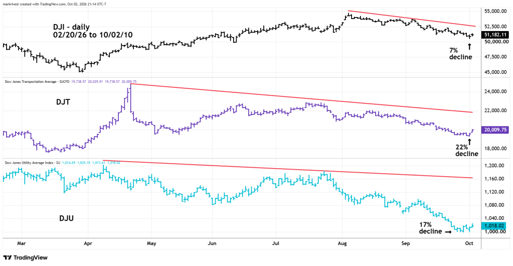
Almost two months before the current Nasdaq Composite top, DJI made a peak on 08/05/26 and subsequently declined about 7%.
DJT, which peaked back on 04/22/26 and has dropped nearly 22%!
DJU, made its top all the way back to 04/09/26 and is down 17%.
There are bearish divergences even among technology stocks. The next daily chart examines the technology sector ETF (XLK) and the semiconductor index (SOX).
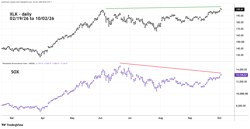
Both indices should be making simultaneous new all-time highs. Yet on 10/02/26 – SOX had only retraced two – thirds of its June to July drop. The Nasdaq Composite bull market is a façade that’s being propped up by a tiny minority of stocks.
From July to August the financial sector ETF (XLF) and the S&P bank index (KBE) were leading the broader U.S. stock market higher. Now they’re leading the way down.
The daily XLF and KBE chart examines their relationship.
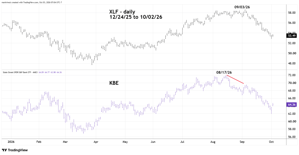
On 08/17/26 – KBE peaked. Its subsequent decline was a warning sign for the XLF which peaked on 09/03/26. Both indices are now trending down and could continue lower in the coming weeks.
Only a small number of technology stocks are making new highs. Consumer Staple stocks are trending down. Consumer Discretionary Stocks are trending down. Health Care stocks are trending down. Of the eleven State Street Sector – ETF’s only the technology sector ETF – XLK made a new high on 10/02/26.
The next blog will examine momentum underneath the surface of price. Hint, it’s even more bearish!

