Point and Figure (PF) charts are a way to visualize price movements and trends in an asset without regard to the amount of time that passes. The columns of X’s represent rising prices. Columns of O’s represent falling prices. This method has been used for more than 130 years and is an excellent tool to objectively view markets and stocks.
The 30 – minute SPX 500 – PF chart courtesy of Trading View illustrates action from October 2022.
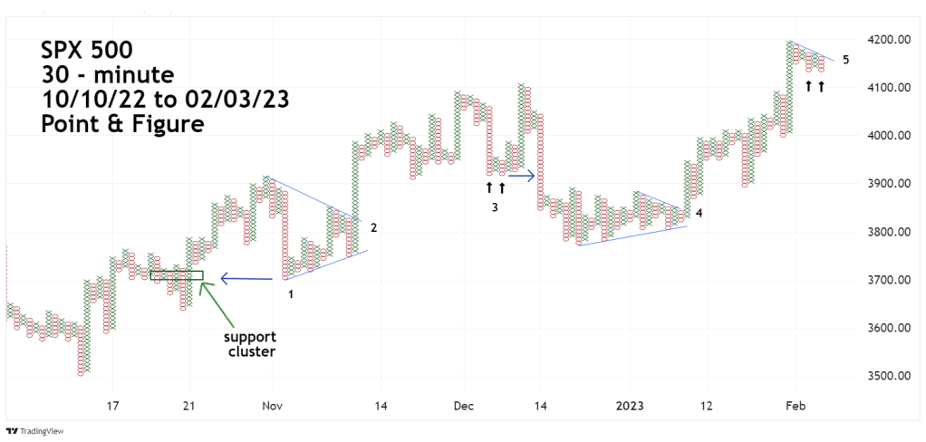
The SPX 500 – Trading View symbol is SPX 500, is an index on Trading View that’s similar to a continuous S&P 500 – futures chart with prices similar to the S&P 500 (SPX) . This is a good index to use with PF because it illustrates potential support/resistance areas outside of the SPX trading session.
Illustrated on the chart are five areas noted 1 through 5 where PF analysis could be used.
Support/resistance zones develop in price clusters. The wideness of the cluster is usually related to the strength of the support/resistance.
Note that in example “1” the decline bottomed out at the lower part of the price cluster.
Example “2” shows the use of trendlines. A break below the rising trendline could have signaled the start of a downtrend. The break in this case was to the upside. The length of a trendline is related to the strength of the breakout. The longer the trendline, the more powerful the breakout. The subsequent breakout in this example was very dynamic.
Example “3” illustrates a double bottom. Sometime there could be a considerable amount of upside action before a double bottom is broken. The initial break of a double bottom/top may not be dynamic; however, it does alert the analyst of additional action in the direction of the break.
Example “4” shows another instance of a break above a declining trendline. Note that the declining trendline in example “4” is shorter than the declining trendline in example “2”. The initial move above the example “4” trendline was less dynamic than the example “2” upside break.
Example “5” shows a potential double bottom forming. Immediate upside action is needed to confirm the double bottom. If there’s an immediate move down it would be a break below a single bottom.
There’s also another declining trendline from the most recent peak. Breaking the declining trendline implies a move above the recent peak.
This is a brief outline of Point & Figure analysis, there are severable books on the subject that give more information. Recommended reading: “Trading the Markets the Point & Figure Way” by Prashant Shah.

a question from a novice, the golden cross implies a reverse of downtrend to uptrend, and here the point and figure douple bottom implies up move then downtrend, so they give reverse signals so what the stronger signal of both to follow.
LikeLike
Hi Mohamed
The Golden Cross on the SPX does not happen very often. Since 1998 its averaged about 1 signal every to years. That is a significant signal. As for double bottoms on PF charts it could be a considerable amount of time before they are broken and it’s possible they may not ever be broken. Double bottoms are simply an area to watch if after a rally there’s another decline. If the bottoms are broken there’s a high probaility for more downside action.
LikeLike
can i know your thoughts on dollar currency (dxy), do you think it will continue to be bullish,or its just a pullback and the downtrend will continue.
LikeLike
Hi Mohamed
Sorry but I do not follow the dollar and have no opinion on its direction.
Mark
LikeLike