State Street SPDR divides the S&P 500 into 11 – sector Exchange Traded Funds (ETF). An examination of two of the sector ETF’s and one sub sector reveals insights to the broader U.S. stock market and economy.
The weekly Financial sector ETF – (XLF) and Technology sector ETF – (XLK) chart courtesy of Trading View illustrates the flow of funds into the U.S. stock market.

Generally, both of these sector funds trend together. Note that XLK made a high in late 2021 and XLF peaked in early 2022. Both made bottoms in October 2022. After March of 2023 there’s been a dramatic change. While XLK has moved marginally above its December 2021 bull market top, XLF has only retraced .618 of its February to March decline. The incredible underperformance of the Financial sector hints there could be serious problems developing in the U.S. economy.
The daily XLF chart shows something peculiar happened on 07/14/23.
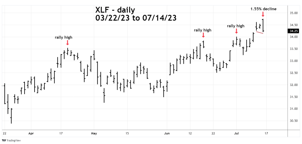
Notice what happened at each of the three prior post March 2023 rally highs. Now look at what happened on 07/14/23. XLF opened at a new rally high then fell 1.55% – a dramatic one-day reversal. Not only did XLF close the session below its prior day low, but it also went below the bottom on 07/12/23!
It takes big money to make big market moves. This looks like it could be stock fund managers selling. Maybe they know something that we don’t know?
The next weekly chart compares the S&P 500 (SPX) with a sub sector – SPDR – Regional Banking ETF (KRE).
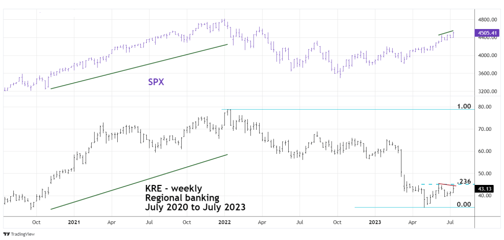
KRE was able to keep pace with the SPX going into the January 2022 top – now things are different.
In early 2023 KRE continued to make new bear market lows.
The KRE – May to June 2023 rally only retraced a Fibonacci .236 of its 2022 to 2023 bear move.
In July 2023 it is continuing to diverge with the SPX! Note that while the SPX has made a marginal new high in July, KRE is below its June peak!
This continuing divergence with one of the main U.S. stock indices is an additional clue there could be serious problems developing in the U.S. economy.
If there are problems with the U.S. economy, its possible the three charts illustrated in this blog have given you more of a warning than most Fundamental analysts you could see on CNBC.
To quote Robert Prechter “The market is the news”.
